Welcome to an exploration of one of the most vital aspects of design and floral artistry: color and color harmony. If you’ve been following my tutorials, you’ll know that I have a particular fascination with color and its impact on design. Color isn’t just about aesthetics; it’s about creating emotional connections and ensuring the overall cohesiveness of your design within its space.
Color harmony goes beyond simply selecting pretty hues; it involves understanding how colors interact with each other and with the environment they inhabit. In this tutorial, I aim to condense the vast topic of color into digestible insights, using a simple bouquet to demonstrate various color harmonies.
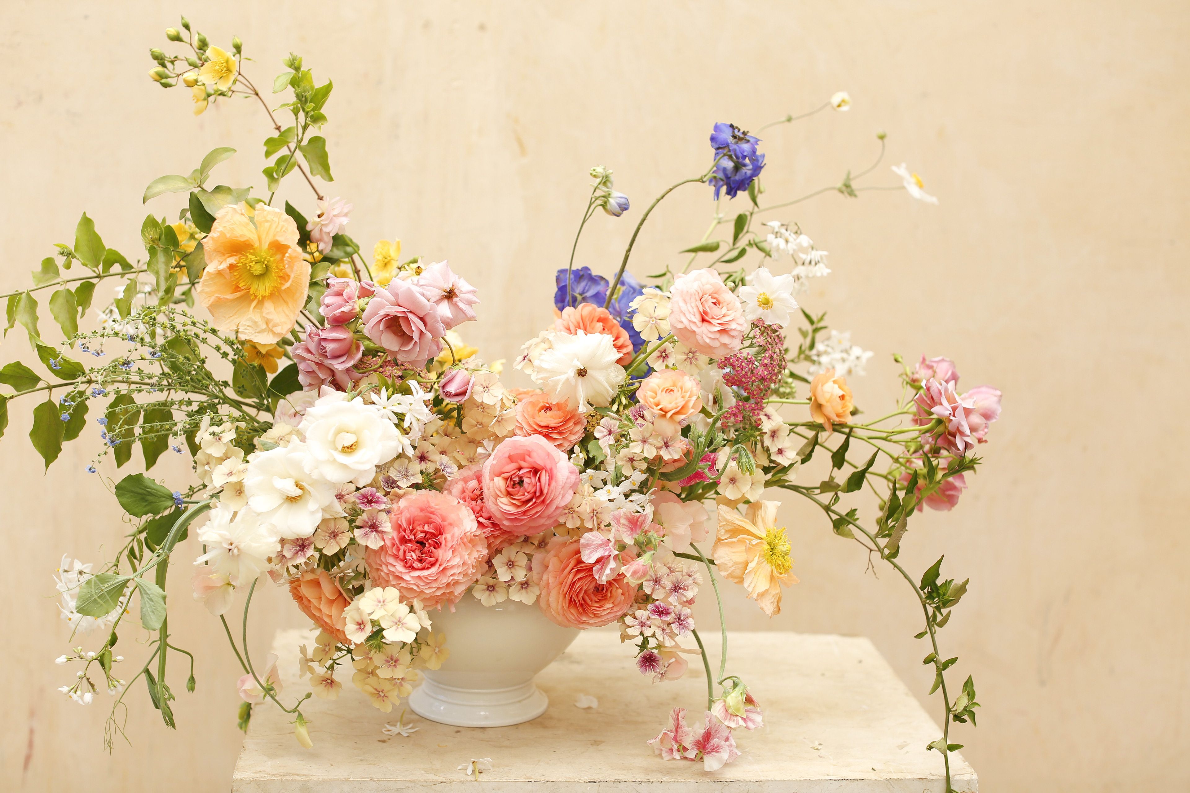
Let’s start with the monochromatic color harmony, where varying shades of a single color are used. Whether it’s whites and greens or shades of pink, the key is to transition smoothly from light to dark tones within the same color family. Even within a monochromatic scheme, subtle variations can add depth and interest to the arrangement.
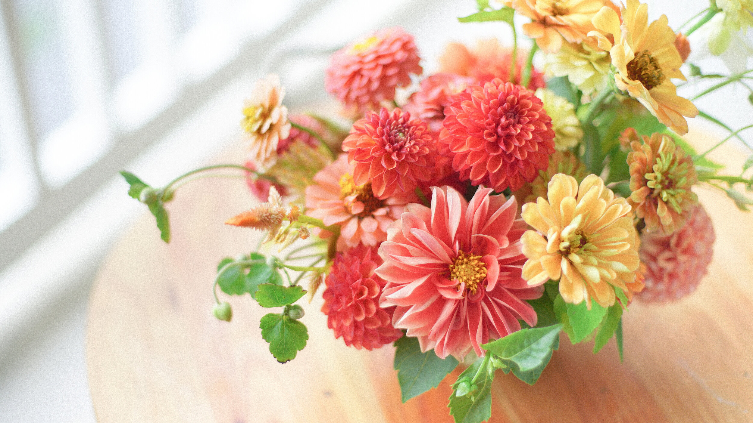
Moving on to the analogous color harmony, we explore colors that sit adjacent to each other on the color wheel. For example, transitioning from oranges to yellows to greens creates a harmonious flow of colors that are visually appealing and cohesive. Analogous color schemes offer versatility and elegance, allowing for nuanced variations within the chosen color palette.
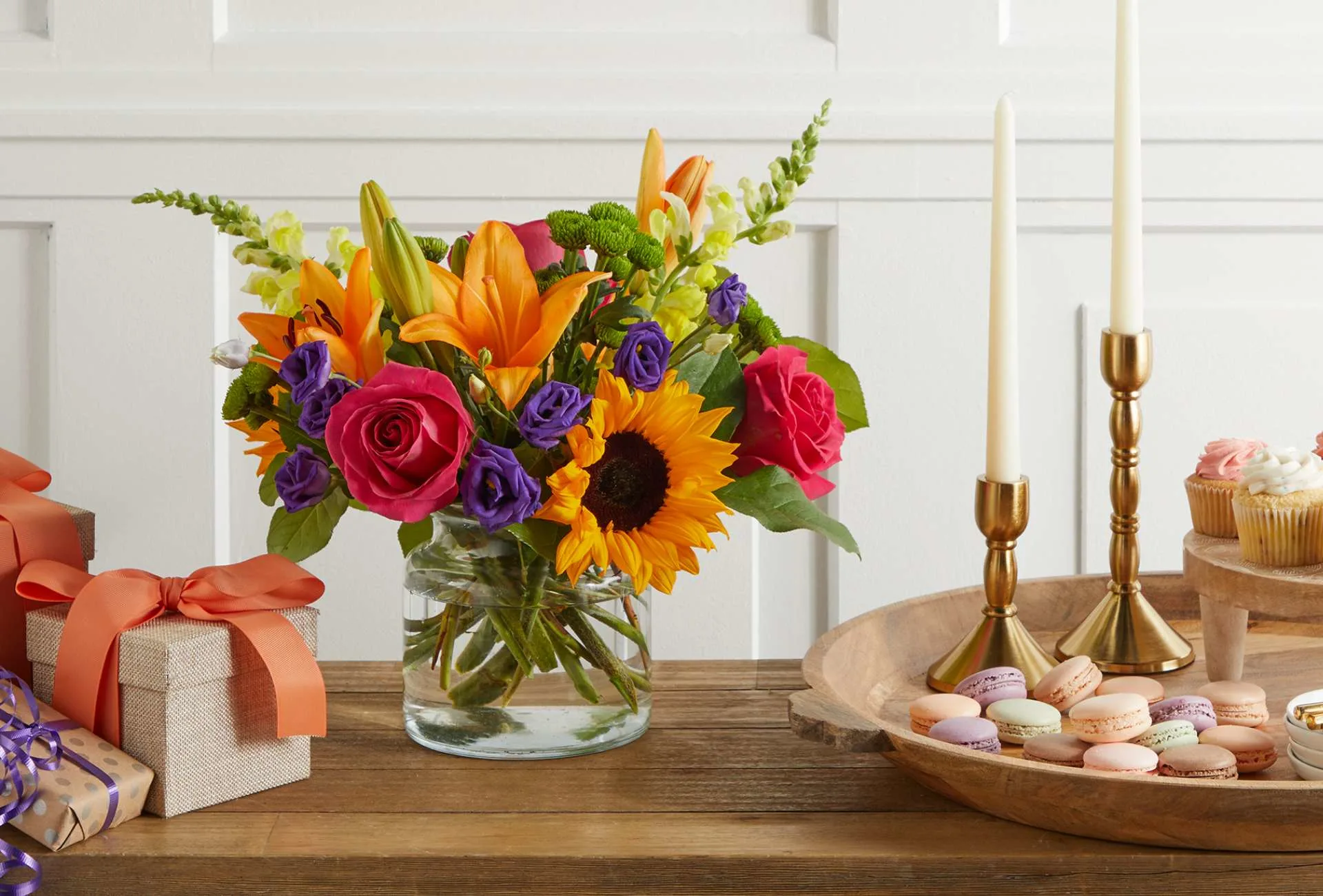
Complementary color harmony takes a bold approach by pairing colors that are directly opposite each other on the color wheel. The contrast between these opposing hues creates a vibrant and dynamic visual impact. From purples and yellows to blues and oranges, complementary color schemes command attention and evoke a sense of energy and excitement.

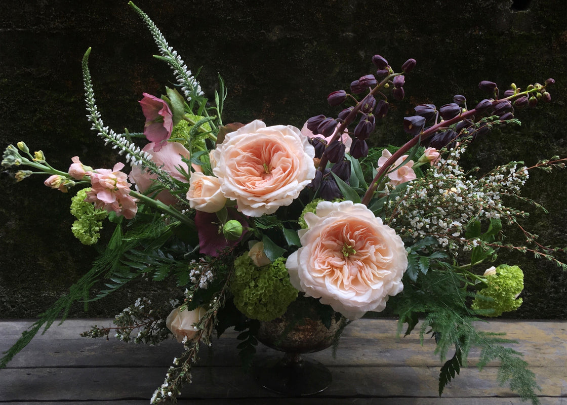
Finally, we delve into the split complementary color harmony, which combines a base color with two adjacent hues to its complementary color. This results in a rich and balanced palette that incorporates a broader range of colors while maintaining harmony and cohesion. By strategically introducing elements from different parts of the color wheel, we create arrangements that are visually striking yet harmonious.
Understanding color and color harmony is essential for any designer, whether you’re creating floral arrangements for a specific space or simply enhancing your home decor. By following these principles and guidelines, you can confidently explore the endless possibilities of color and unleash your creativity in floral design.
In this tutorial, we’ll delve deep into the intricacies of color theory and explore various color harmonies, accompanied by practical demonstrations using simple yet elegant bouquets.
Let’s begin our exploration with the monochromatic color harmony. Picture a bouquet composed of varying shades of a single color, from delicate pastels to rich, deep tones. Whether it’s an ethereal combination of whites and greens or a romantic array of pinks, mastering the art of transitioning seamlessly between light and dark tones within the same color family is essential for creating visually stunning arrangements.
Next, we’ll venture into the realm of analogous color harmony. Imagine hues that sit harmoniously next to each other on the color wheel, such as oranges transitioning into yellows and greens. Analogous color schemes offer a sense of unity and cohesion, allowing for subtle variations and graceful transitions between colors. By understanding the natural flow of colors, you can create arrangements that exude elegance and sophistication.

Now, let’s explore the dynamic interplay of complementary colors. Picture vibrant contrasts and bold combinations, where colors opposite each other on the color wheel come together to create a striking visual impact. From the electrifying pairing of purples and yellows to the fiery combination of blues and oranges, complementary color schemes demand attention and leave a lasting impression.
Lastly, we’ll unravel the beauty of split complementary color harmony. This sophisticated approach involves selecting a base color and complementing it with two adjacent hues to its complementary color. The result is a harmonious blend of colors that offer depth, balance, and versatility. By strategically incorporating elements from different parts of the color wheel, you can create arrangements that are both visually captivating and harmoniously balanced.
As we journey through the world of color in floral design, remember that understanding color theory is the key to unlocking your creative potential. Whether you’re crafting bouquets for special occasions or adorning your living space with floral arrangements, let color be your guide and inspiration.
Let’s begin our exploration with the monochromatic color harmony. Picture a bouquet composed of varying shades of a single color, from delicate pastels to rich, deep tones. Whether it’s an ethereal combination of whites and greens or a romantic array of pinks, mastering the art of transitioning seamlessly between light and dark tones within the same color family is essential for creating visually stunning arrangements.
Next, we’ll venture into the realm of analogous color harmony. Imagine hues that sit harmoniously next to each other on the color wheel, such as oranges transitioning into yellows and greens. Analogous color schemes offer a sense of unity and cohesion, allowing for subtle variations and graceful transitions between colors. By understanding the natural flow of colors, you can create arrangements that exude elegance and sophistication.

Now, let’s explore the dynamic interplay of complementary colors. Picture vibrant contrasts and bold combinations, where colors opposite each other on the color wheel come together to create a striking visual impact. From the electrifying pairing of purples and yellows to the fiery combination of blues and oranges, complementary color schemes demand attention and leave a lasting impression.
Lastly, we’ll unravel the beauty of split complementary color harmony. This sophisticated approach involves selecting a base color and complementing it with two adjacent hues to its complementary color. The result is a harmonious blend of colors that offer depth, balance, and versatility. By strategically incorporating elements from different parts of the color wheel, you can create arrangements that are both visually captivating and harmoniously balanced.
As we journey through the world of color in floral design, remember that understanding color theory is the key to unlocking your creative potential. Whether you’re crafting bouquets for special occasions or adorning your living space with floral arrangements, let color be your guide and inspiration.
So, fellow designers and flower enthusiasts, embrace the power of color, experiment with different harmonies, and unleash your creativity in the world of floral design. With a solid understanding of color theory and a touch of imagination, the possibilities are endless.
Join me on this colorful adventure, and let’s create beauty that delights the senses and uplifts the soul.

Happy designing!


